It’s 2012. In an unfinished hotel back office, Richard Valtr convinces a hotel owner to give him the money to build his own hotel guest solution, which soon develops into a cloud-based property management system. In short: Mews is born. The vision is to provide a connected solution, free of clunky old-world tech. Soon after, a logo is designed by the same graphic designer who created the hotel’s logo, for the system which will attempt to become its PMS and guest management tool. And that’s the way it stays for 8 years.
Jump cut to February 2020. In Prague, a room full of 400 people erupts into spontaneous cheers and applause. It’s the annual Mews company gathering and Leah Anathan, Mews CMO, has just presented the concept for the new branding. The post-speech enthusiasm is tangible, and the creative team behind the new brand know that they’re onto a winner. There's still plenty of work to do, but timelines are set and – barring anything dramatic – it should be plain sailing from here.
Jump cut again.
It’s October 2020. The industry has changed. The world has changed. And now, Mews has changed too. Despite the challenges facing us, we’re confident that the new-look Mews is perfectly suited for today and for the rapidly changing future. The core of what we believe still holds true, and in fact, that vision of connected, innovative hospitality from back in 2012 is more relevant than ever.
We’re beyond excited to share the new Mews with you. If you haven't already, take some time to explore our new website and you’ll instantly get a feel for our new look; both familiar, but also something completely different. So how did we get here and why did we choose to do so? Here's the story of our remarkable new branding.
Why did Mews need to rebrand?
Mews already had a logo and a style, and that little house bookmark icon and deep yellow served us well over the years. But the truth is, we’ve outgrown them. Matt Welle, CEO at Mews, explains: “Mews has grown tremendously, not just in terms of size, but also what our product represents today. We needed a real upgrade to better represent who we’ve become as people and what our company has become over time.”
"The other part of the equation is our customers and our partners,” adds Leah. “We've got a very diverse community, but the way we communicated was pretty much the same for everyone. So the new branding isn’t just about being able to tell the Mews story, it's about being able to tell what Mews does to help improve the hotel operation and guest experience. Everyone who interacts with our software is critically important to Mews.”
So what is a brand, exactly? The answer may seem obvious at first, but it’s more complicated than you might think. The Mews leadership team were sure to properly explore what they thought Mews really means and stands for.
“In the early days, we just thought a brand was a logo, a type font and some colors,” admits Matt, “but we needed to be much more sophisticated this time. We could have gone for the obvious and created branding that was linked to a hotel or a bed, but we felt that doesn't represent where our company will go into in the future. Hotels are where our roots lie today, but there's so much more in the world that we can tackle with this incredibly versatile platform, and we want our brand to really represent that.”
Richard Valtr, the man whose vision started Mews back in 2012, agrees: “A brand isn’t just something that you put on a t-shirt or at the top left of a page – it's actually something that represents who you are as a company and can express in multiple ways all the different angles of where you're going. We were looking for something that expressed the evolution of Mews but also the versatility of the brand and all the different areas that we are active in now and the near future.”
Trusting the process
Once we’d decided to start the rebrand process, the next step was finding a great design agency. Enter Design by Structure, a London agency who specialize in B2B branding and digital design. Jesse Swash is the Co-Founder at DBS and worked for almost a year on the Mews project. “Success is rooted in the idea that a brand matches and speaks to the customers and the audiences that you're trying to reach,” he says. “But it's also got to be different enough from your competitors that you're memorable and people think, ‘I want to work with them’.”
“Jeff Bezos said that a brand is what people say about you when you're not in the room,” adds Leah. “That's exactly what this project was about – I think people understand Mews today when they're in the room with us, but we want them to be able to just as easily understand when they're not in a one-to-one meeting with someone from Mews.”
The job of distilling the company’s products and values into a core brand identity fell to Jesse and his team at DBS, and they began with invaluable data collection. “We did interviews with customers, prospects, people from Mews, mystery shopping... It’s lots of listening and asking questions, and usually something exceptional comes out of these conversations that you can build the brand and positioning around. It's a little bit like being a detective.”
Standing out from the crowd
There are plenty of traditional property management systems out there, but we wanted to think bigger. To really redefine what we can do and the space we occupy.
“Our ambition was to follow the brands who created a category of one where they're so distinctive that they really don't have any competition,” says Leah. “We looked at Tesla, SpaceX, SquareSpace and Sonos and we took some inspiration from those guys. You always have to look at the innovators, whatever the industry.”
Jesse and DBS sifted through their countless hours of conversations and competitor research to uncover what it was that would put Mews into that category of one. “Very quickly it became clear that with Mews, it was the idea of creating remarkable and memorable experiences, the desire to remove clunky old systems and break down the barrier between hoteliers and guests.” Once this key concept was in place, it was a question of translating the idea into a visual style.
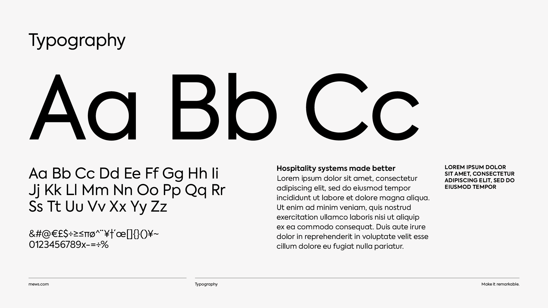
Defining the new visual style
Vic Irwin is the Creative Director at Mews and played a big role in defining the visuals. “We wanted to balance tech and lifestyle. That was really important because that’s also a representation of the team at Mews, half tech people and half hospitality.” But Vic’s keen to point out that the visuals are only truly effective once all that hard strategy work has been done. "If you don't do the strategic work right, pinpointing the positioning and the messaging, then the visuals are just a sticky plaster – probably a really pretty one, but it's not going to have any longevity.”
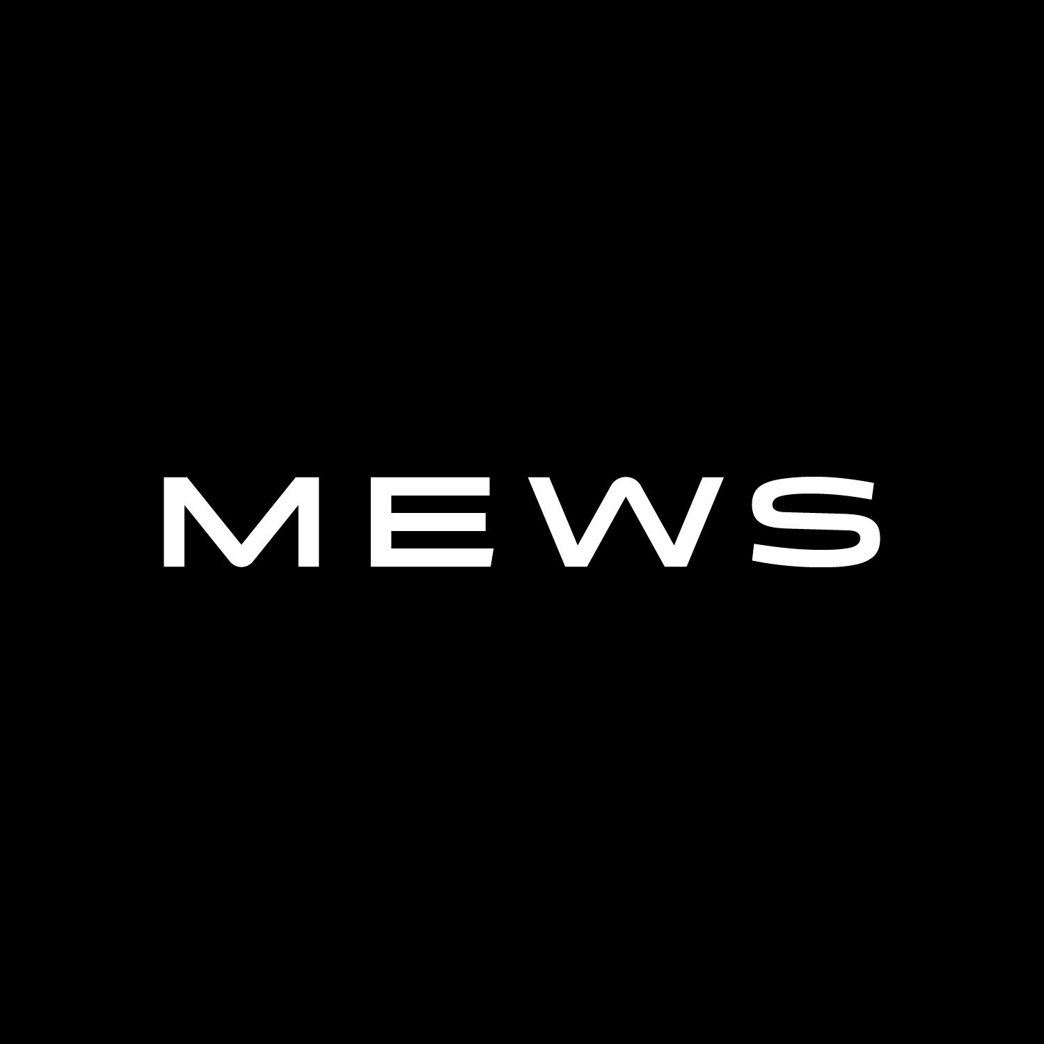
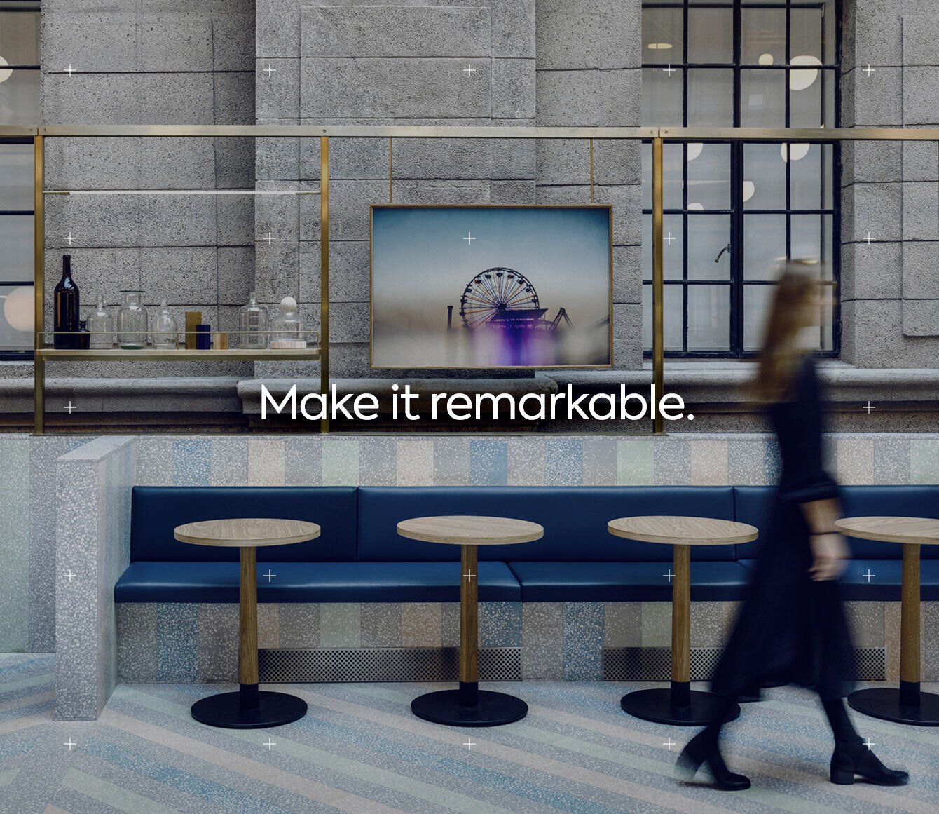
A rebrand is a little like making a film. A series of skilled professionals with different specialties all come together to create a whole bigger than the sum of its parts. Another collaborator was Sawdust, a creative agency who were tasked with designing the logo and other visuals. The result of their work is a logo that’s elegant in its simplicity.
![]()
As Richard explains: “There’s a bit of space age design to it, but at the same time, it retains this softness and playfulness that we've always had as a company. That's really something that we wanted to capture visually, and I think it will hold us in really good stead for the future.”
The M and the W are versions of each other, reflecting the fact that the software enhances the experience both internally for hotel staff and externally for guests. The curved lines are a gentle nod to NASA and the idea of space that Richard spoke about, heralding a new universe that’s both futuristic but also welcoming.
Taken as a whole, it’s a bold new look, and one that took a little time for some of the team to embrace. “I struggled a bit throughout the process,” Matt admits. “When all the elements were on their own, it didn’t look like much and I couldn’t picture what it would look like as a whole. I was always pushing for more extreme options, more colors, but I’m glad that I trusted everyone because it really came together.”
"I can go in lots of different directions,” says Richard of his creative process, “and it was invaluable to have somebody of Vic's tastes, as well as Leah to shepherd the entire process through all of these different possibilities. We really settled on something that just makes sense and is actually very beautiful when you bring it all together.”
Working during a pandemic
Of course, this wasn’t just a typical rebrand project. In early March, most of Europe shut down as it grappled with COVID-19. All the project research was already done, and work had begun on conceptualizing the new look. But did the pandemic make things harder? Of course.
“I do not ever recommend a rebrand when 100% of the team is working from home,” says Leah, emphatically. “That was so heavy. We're thrilled with the outcome, but the hours on video calls were relentless.”
Vic agrees. “Usually I’m standing with a team and I’m saying, ‘Let’s move this around; why don’t we try it like this?’ – we’re in the same room and we’re sketching things out with Sharpies and working things out. But with Sawdust, I’ve actually never sat in the same room as them, which is bizarre. When you're connecting a few different agencies and stakeholders, it definitely has its challenges.”
But there were never any doubts about moving forward with the project. It was something that the leadership team knew the company needed. "It’s a multi-year project that unfortunately just coincided with COVID,” explains Matt. “You just can't pull off a rebrand like this in four or five months during a pandemic. It has to be much more well out planned and we've been wanting to do this for a long time.”
As usual, Richard is in agreement. "The pandemic has coincided with the rebrand but in another sense, it's also coincided with us changing as a company, growing up a little bit, leading. Pandemic or no pandemic, this was the right time to do it. Things have definitely changed within the hospitality industry, and I think that this is actually a great time to show that we are also changing ourselves and not clinging to the past.”
A new era of hospitality
As Mews continues to scale up, we’re entering a new age as a company. More mature, refined, and ready to take on even bigger challenges. The new Mews tagline, Make it remarkable, sums it up perfectly. “All your customers that we met and interviewed, all the people we met in your company, are remarkable people,” says Jesse. “It’s something that you can truly live by. And that makes you different from the gray suits and white shirts at more traditional providers.”
Part of the new era is an emphasis on simplicity. One of the big changes we made are with the product names, making it easier for clients to immediately grasp what each piece of the Mews solar system is, and how they fit together. There are now six core products:
- Mews Operations
- Mews guest experience software
- Mews Payments
- Mews hotel reporting software
- Mews Marketplace
- Mews API
“We had strange names that didn't really make sense anymore,” says Matt. “Talking to the right customers and using the language that they understand was a huge piece of the puzzle. We really wanted to make sure that whoever lands on a particular webpage immediately gets what we do.”
“People often try to make technology a thing in itself, when in fact it's just a tool for the person using it,” continues Richard. “There's a great wave of humanizing technology. As Matt says, you need to speak to people in a way and in a language that everyone can understand that doesn't feel exclusive. Going back to Leah’s branding concept speech at the Mews conference in February, I think that's why it hit home so well: it was very simply spoken but just had a lot of depth behind it.”
The future starts now
It took a remarkable effort from so many people to get the rebrand over the finish line. From product marketers to web designers to copywriters and everything in between, it was a Herculean effort. But the exciting part is, this is only the beginning of the new Mews.
In fact, Leah is already raring to go with the next chapter. “My favorite part is actually the next phase, because we get to actually live and breathe and implement it at Mews. This is where all of the team will infuse all of this brand concept with our personality and our ambitions and our product updates and our launches and all of the exciting things that we want to do, and it'll move and grow and live in ways that we haven't imagined yet.”
As you may have noticed, excitement levels are high. But the team is confident that it’s not misplaced – that Mews is well set for the future. Here’s the final word from Matt:
“What I loved about the process is that it was very open, and we got as many perspectives as possible. It’s not like it was just Richard and I that came up with these ideas and then we pushed them on other people: we wanted this to be a team effort and we want the entire company to rally behind it – and it worked because everyone in the company is excited about it.”
Whatever the future of hospitality will bring, Mews is ready to help lead the way forward.
Let’s make it remarkable.

.webp)