Is your hotel’s website truly responsive?


Have you ever browsed your hotel's website using your phone or tablet? With nearly 90% of people using multi-screens in a day, assuring your hotel's mobile presence is sharp a key business asset to increase direct bookings and have a solid web presence.
As consumers use their devices to practically everything, from eating to travelling, responsiveness is beyond a hot word, turning into an important element to consider for your hotel's online presence. Responsive websites not only present your hotel to potential guests in the best possible way and convince them to book a room with you, but also with a pleasant, easy and fluid online experience.
According to Google Research, smartphones are the most common starting point in cross-device browsing, as 55% of users price research in multiple screens and sequentially when looking for travel information. And 75% of travellers who look for hotels on their phones will typically book on a laptop or desktop computer, with over 95% of bookings done in a computer.
The numbers certainly indicate that, although laptops and desktop computers are important, mobile devices are here to stay and increasingly more influential in your guest's life. Hoteliers, aware of those changes and trends in consumer behaviour, are reacting with responsive websites, apps, and more.
Your options
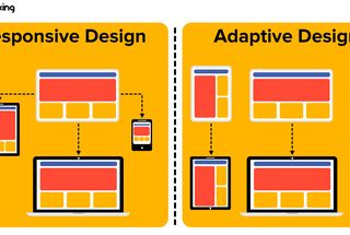
A responsive website answers to user's behaviour and environment, specifically considering device, screen size, platform, and orientation. No matter what device you use, responsive websites will always use the same address or URL, like www.yourwebsitename.com. The content also remains the same, although images, videos, and other graphics are resized to fit the screen size and improve your guest's readability.
On the other hand, adaptive web design presents a device optimized version of your website. The size changes as the Internet identifies you're browsing from a mobile, so it loads faster as the resizing is done before it reaches your mobile. Last but not least we have separate mobile websites. Usually presented as a subdomain of the regular website, like www.m.yourwebsitename.com, those websites are optimized for mobile devices from their conception but keeping in mind users will navigate from a mobile device.
These three terms are not exclusive from each other as you can navigate a responsive website for laptops and tablets, and then browse the same page from your phone using a mobile site.
Checking your assets
By now you must be wondering what your website does in every imaginable platform, so we have a quick solution for you:
Check your browser right now Simply write the address and leave it open. Then expand and contract your window. If you content adjusts to the sizes, your website is using responsive design and passed the test.
Use your own devices Have an e-reader, a smart TV, a tablet, and a smartphone? Again type your hotel's address and navigate. This is the best way to experience what your potential guest see when they are on your website.
Fake it There are some online emulators that will give you an idea of how your website looks on different devices. Some popular emulators are Am I Responsive? and Screenfly.
Failed the test?
If you realized your website is not as responsive as you imagined (or is not responsive at all), have no fear. Some corrective actions go from changing your template to talking to a designer and update your website to the latest standards.
Do you have any questions related to responsive or web design? Let us know in our social media in Facebook or @Base7booking, and we'll give you great tips and advice for your hotel.